

project overview
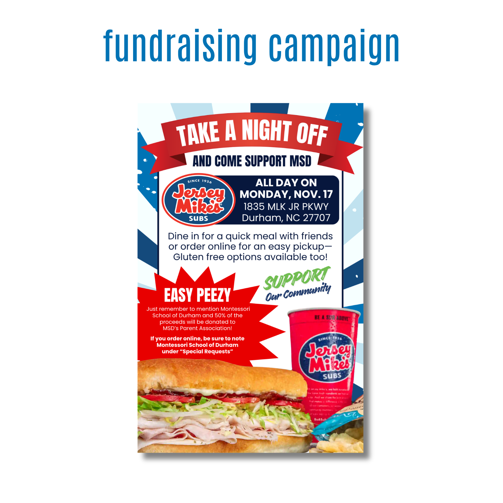
Designed a promotional campaign flyer for a Montessori School of Durham fundraiser in partnership with Jersey Mike’s. The objective was to create an attention-grabbing piece that would encourage community participation, clearly communicate event details, and support fundraising efforts for the school's Parent Association.
objectives
Increase awareness and participation in the fundraising event.
Clearly communicate how supporters could contribute to the fundraiser.
Maintain brand recognition for both Montessori School of Durham and Jersey Mike’s.
Create a visually engaging design that motivates immediate action.
creative approach
Developed a bold flyer that leverages strong typography, vibrant brand colors, and appetizing food imagery to capture attention quickly. The layout prioritizes key information, leading viewers from the primary call-to-action to event details and participation instructions. Strategic use of visual contrast and graphic elements helps break up content while maintaining readability and visual interest.
skills demonstrated
Event Marketing & Promotion
Typography
Visual Hierarchy
Brand Integration
Layout & Composition
Print Design
Community Engagement Campaigns
Creative Concept Development
Marketing Communications
results
Delivered a visually compelling fundraising flyer that effectively communicated event details and participation requirements while reinforcing community involvement. The final design helped promote the partnership and support fundraising efforts through clear messaging and strong visual appeal.
project overview
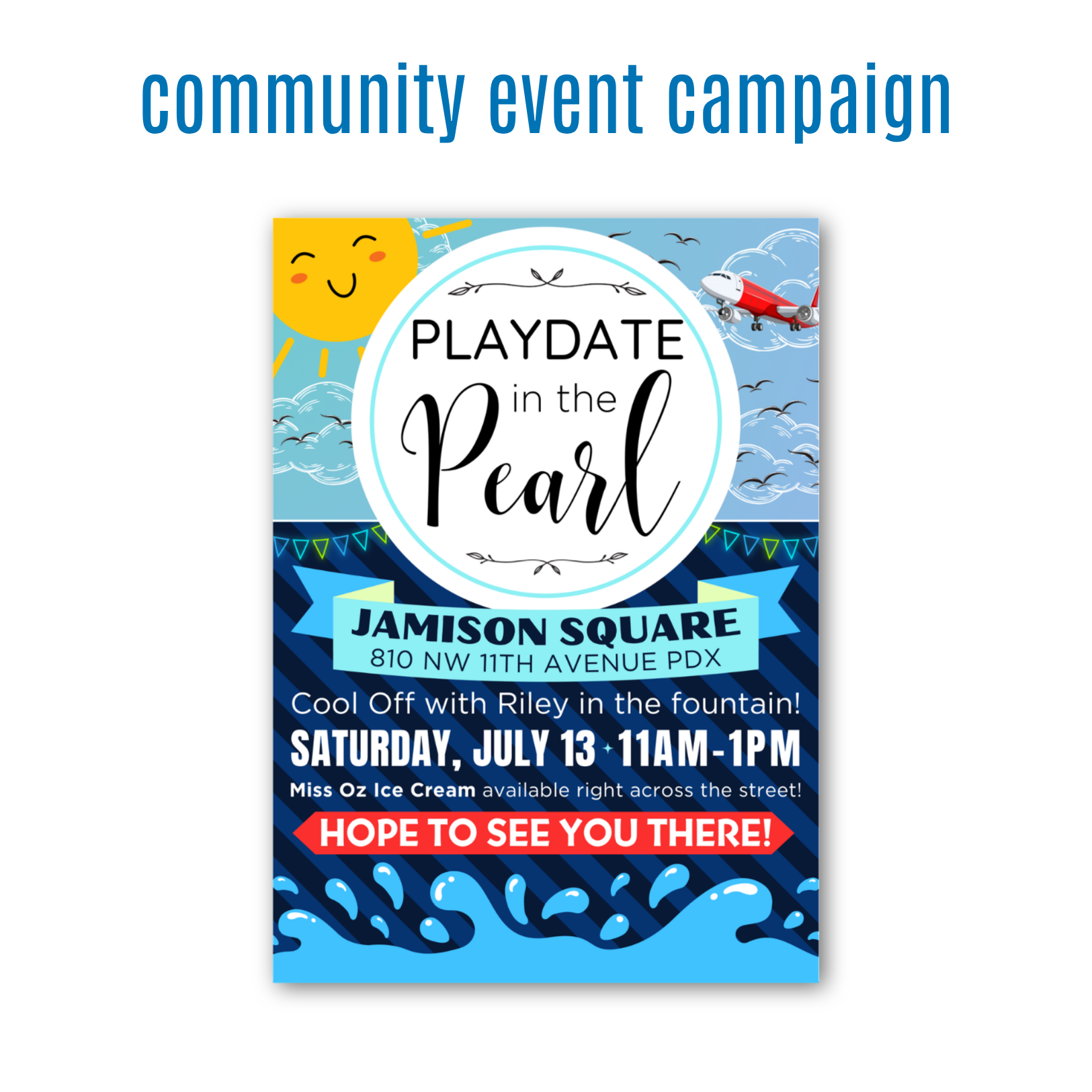
Designed a promotional campaign flyer for a family-friendly community event in Portland's Pearl District. The goal was to create a fun, energetic piece that would attract families, communicate event details clearly, and encourage local community participation.
objectives
Increase awareness and attendance for the community event.
Create a family-friendly design that appeals to parents and children.
Clearly communicate event location, date, time, and activities.
Develop a visually engaging piece that stands out both digitally and in print.
creative approach
Created a playful, summer-inspired design that captures the excitement of a day spent outdoors with family and friends. Bright colors, whimsical illustrations, and bold typography work together to create an inviting atmosphere that immediately communicates fun and community. The design uses visual storytelling to reflect the event experience, incorporating sunshine, water elements, and local references that help attendees imagine themselves participating. A strong information hierarchy ensures viewers can quickly identify the event name, location, and key details while maintaining a lively and engaging aesthetic.
skills demonstrated
Event Marketing & Promotion
Flyer Design
Community Engagement Campaigns
Typography
Visual Hierarchy
Layout & Composition
Illustration Integration
Brand & Event Identity
Print & Digital Design
Visual Storytelling
results
Delivered a cheerful and engaging event flyer that successfully promoted a local community gathering while creating excitement among families. The final design helped communicate event details in a clear, accessible way while reinforcing a sense of community and connection within the Pearl District in Portland, Oregon.
project overview
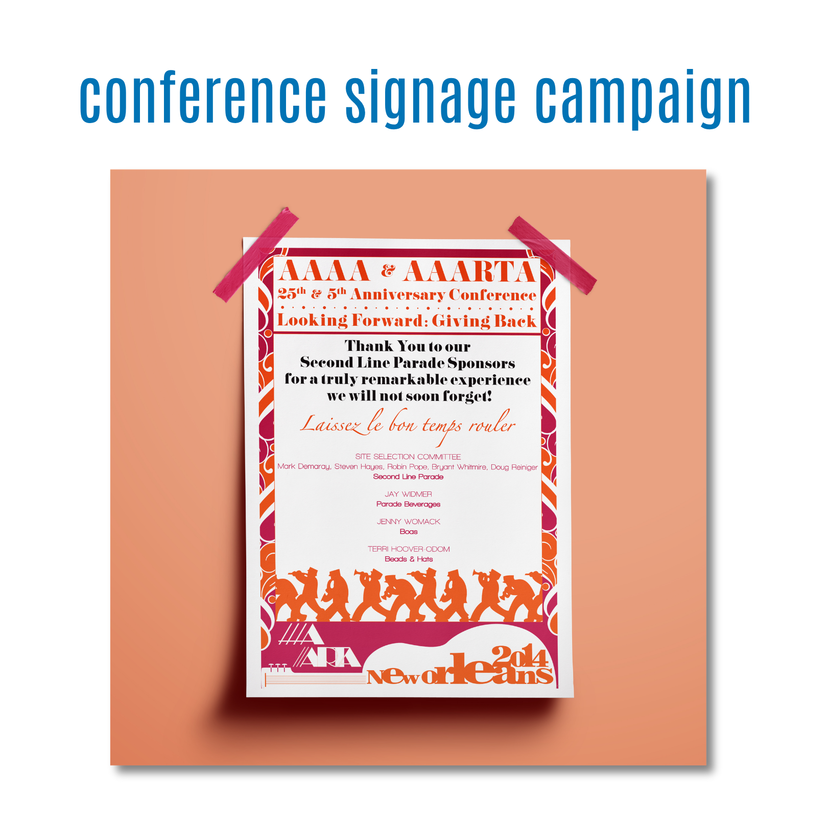
Designed a commemorative recognition poster for the AAAA & AAARTA 25th and 5th Anniversary Conference in New Orleans. The purpose of the piece was to acknowledge and celebrate event sponsors while capturing the energy, culture, and spirit of the conference experience.
objectives
Recognize and thank sponsors for their contributions to the conference.
Create a visually memorable keepsake that attendees and sponsors would value.
Reflect the celebratory atmosphere and cultural identity of New Orleans.
Balance decorative elements with sponsor recognition and event branding.
creative approach
Inspired by the vibrant culture of New Orleans, I developed a design that incorporates bold color and festive patterns to create a sense of movement and celebration. The layout was carefully structured to ensure sponsor recognition remained the focal point while surrounding visual elements enhanced the overall experience and reinforced the event theme. The use of warm oranges, magentas, and decorative motifs helped establish a lively and energetic tone, while typography selections created contrast between formal recognition messaging and the event's festive personality.
skills demonstrated
Event Collateral Design
Poster Design
Typography
Visual Hierarchy
Layout & Composition
Brand & Event Identity
Print Design
Creative Concept Development
Sponsor Recognition Materials
Visual Storytelling
results
Delivered a visually engaging poster that celebrated sponsors while enhancing the overall conference experience. The final design successfully blended appreciation, event branding, and cultural storytelling into a memorable piece that reflected the significance of the anniversary celebration.
project overview
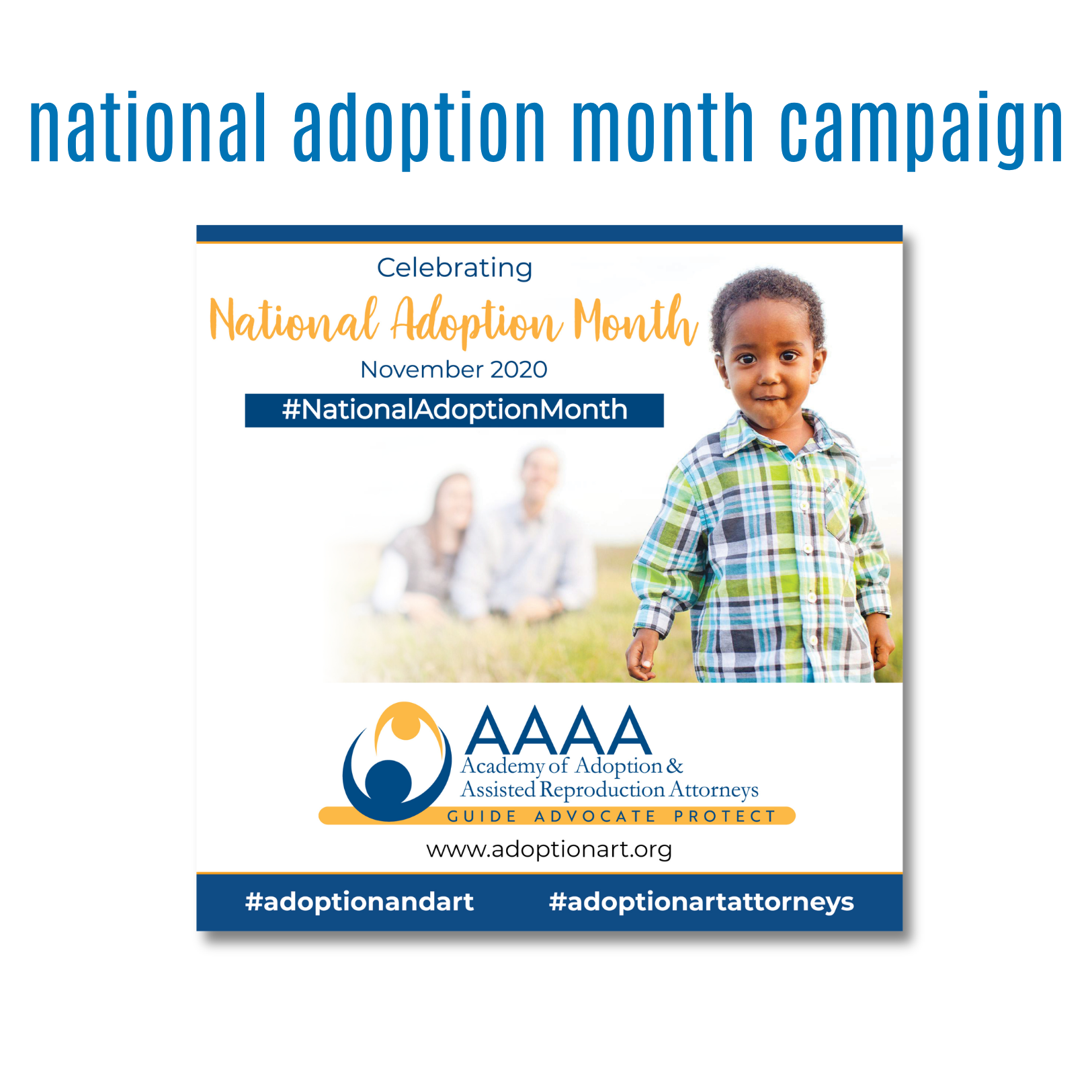
Designed a social media graphic for the Academy of Adoption & Assisted Reproduction Attorneys (AAAA) in recognition of National Adoption Month. The objective was to raise awareness, celebrate the importance of adoption, and reinforce the organization's commitment to supporting adoptive families and adoption professionals.
objectives
Promote National Adoption Month through a visually engaging digital campaign.
Increase awareness of adoption advocacy and family-building resources.
Maintain consistency with AAAA's established brand identity.
Create a shareable social media asset that would resonate with a broad audience.
creative approach
Created a clean, uplifting design that places the focus on the child while supporting the message of hope, belonging, and family. The composition combines professional branding with warm, relatable imagery to create an emotional connection with viewers. Careful use of white space, typography, and brand colors ensures the message remains clear, accessible, and impactful across digital platforms. The design balances advocacy and celebration, allowing the imagery and messaging to work together to communicate the positive impact adoption has on children's lives.
skills demonstrated
Social Media Design
Digital Marketing Graphics
Brand Consistency
Typography
Visual Hierarchy
Layout & Composition
Audience Engagement
Marketing Communications
Creative Concept Development
Visual Storytelling
results
Delivered a professional and emotionally engaging social media graphic that helped promote National Adoption Month while strengthening AAAA's digital presence. The final design successfully combined advocacy, awareness, and brand messaging into a cohesive piece that encouraged engagement and supported the organization's mission.
project overview
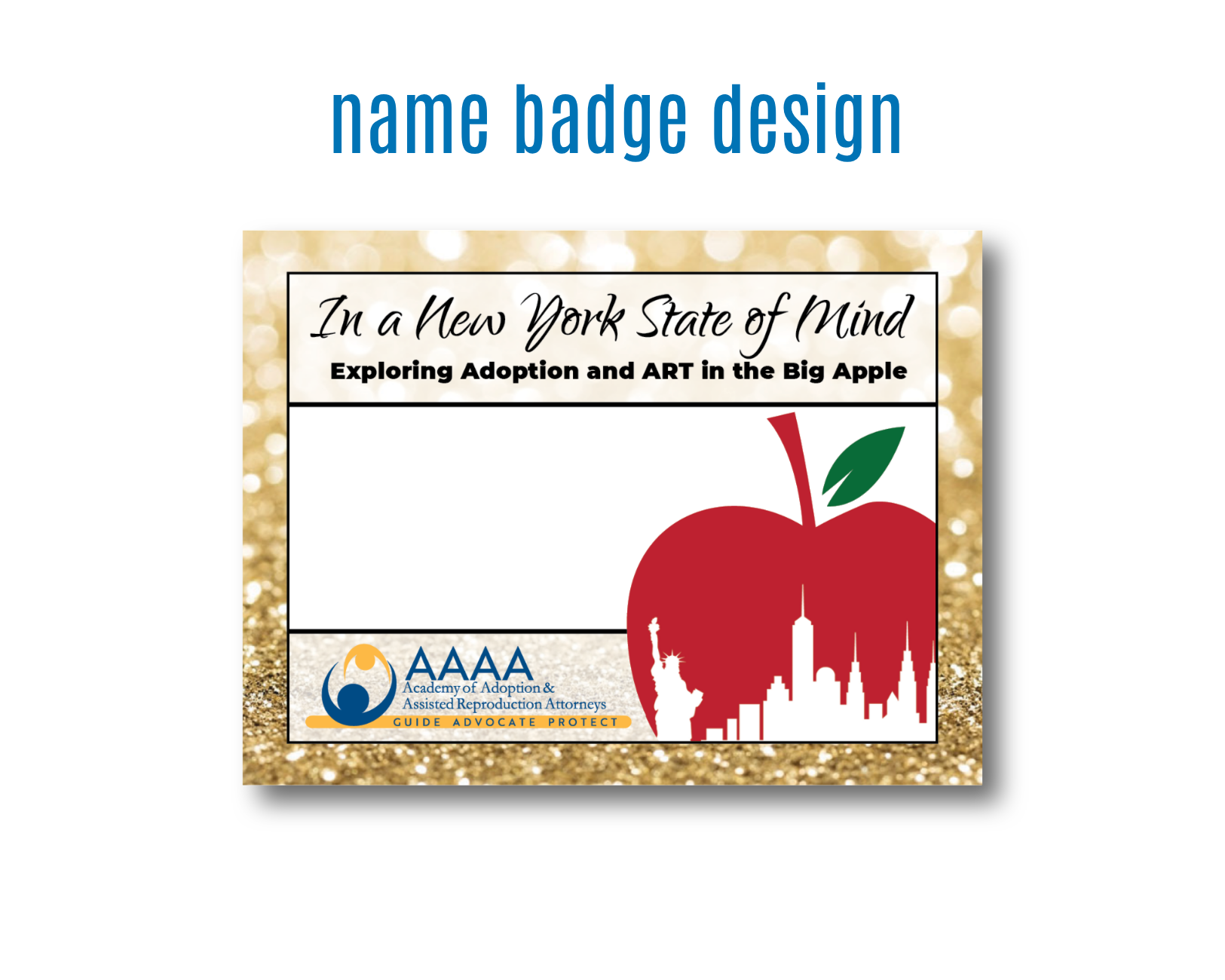
Designed a custom conference name badge for the Academy of Adoption & Assisted Reproduction Attorneys (AAAA) Annual Conference. The goal was to create a functional attendee badge that not only displayed participant information clearly but also reinforced the conference theme and destination through a memorable visual identity.
objectives
Create a professional, easy-to-read name badge for conference attendees.
Incorporate the conference theme, "In a New York State of Mind: Exploring Adoption and ART in the Big Apple."
Reflect the host city's personality while maintaining AAAA brand standards.
Balance functionality with visual appeal for use throughout a multi-day event.
creative approach
Drawing inspiration from iconic New York imagery, I developed a design that combines recognizable city elements with the conference branding to create a cohesive experience. The featured apple graphic, city skyline, and Statue of Liberty silhouette immediately establish the conference location, while the clean layout provides ample space for attendee information. The design was intentionally kept simple and organized, ensuring names and credentials would remain visible in presentations, and conference events while still feeling connected to the event's overall theme.
skills demonstrated
Event Branding
Conference Collateral Design
Typography
Visual Hierarchy
Layout & Composition
Environmental & Experiential Design
Brand Consistency
Print Design
Creative Concept Development
Information Design
results
Delivered a professional and visually engaging conference name badge that enhanced the attendee experience while supporting the event's overall branding. The final design successfully combined functionality, organization, and thematic storytelling, helping create a cohesive visual identity throughout the conference.
project oveview
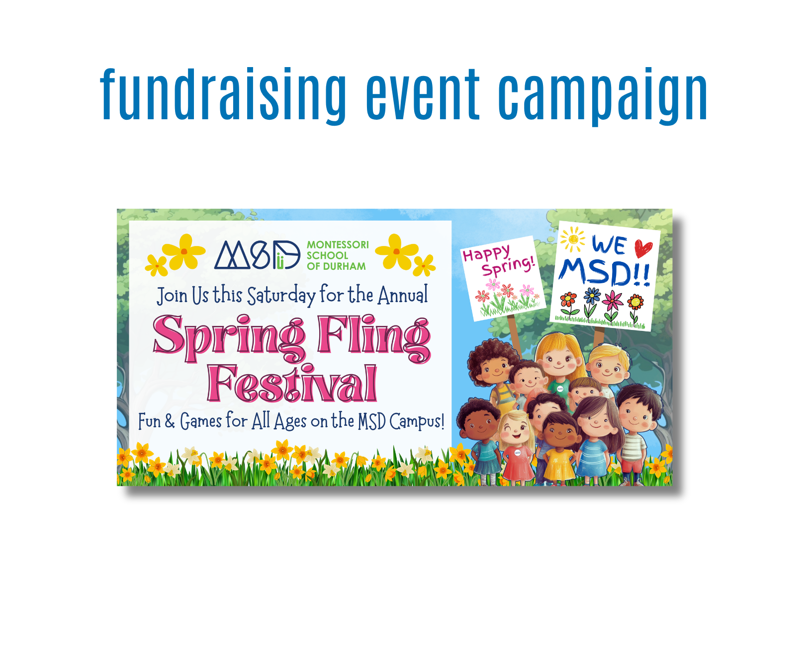
Designed a large-format vinyl banner to promote Montessori School of Durham's annual Spring Fling Festival. The goal was to create an eye-catching event graphic that would generate excitement among families, increase event awareness, and reflect the school's welcoming, child-centered community culture.
objectives
Drive attendance for the annual Spring Fling Festival.
Create a highly visible banner that could be easily read from a distance.
Maintain consistency with the Montessori School of Durham brand identity.
Appeal to parents, students, and community members through a warm, family-friendly visual experience.
creative approach
Developed a vibrant spring-themed design that combines playful typography, cheerful illustrations, and engaging imagery to capture the energy of the event. The layout establishes a clear visual hierarchy, guiding viewers from the school branding to the event name and supporting details. Bright seasonal colors, floral elements, and child-focused graphics reinforce the festival's fun and welcoming atmosphere while maintaining readability in a large-format environment.
skills demonstrated
Large-Format Design
Event Marketing & Promotion
Visual Hierarchy
Typography
Brand Consistency
Layout & Composition
Audience-Focused Design
Print Production Preparation
Creative Concept Development
Visual Storytelling
results
Delivered a visually engaging promotional banner that effectively communicated event details while reinforcing the school's family-oriented brand. The final design provided a welcoming and memorable visual presence for campus visitors and event attendees.
project overview
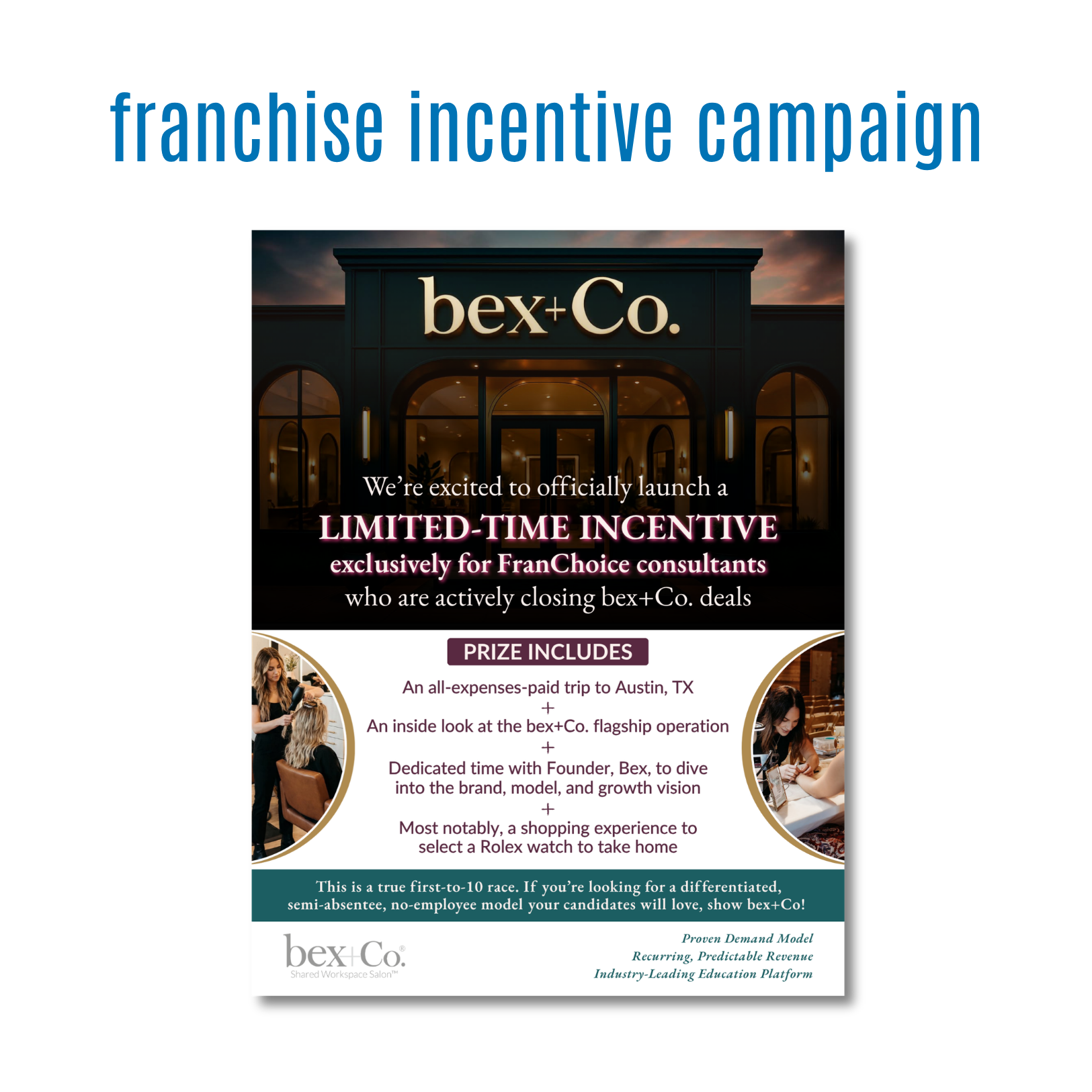
Designed a promotional one-pager for Bex+Co to support a franchise incentive campaign targeting consultants. The goal was to communicate a limited-time opportunity that felt premium, aspirational, and aligned with the brand's luxury salon concept while motivating consultants to take action.
objectives
Generate excitement around a time-sensitive franchise incentive program.
Clearly communicate the benefits and value of the promotion.
Reinforce Bex+Co's premium brand positioning.
Create a sales-focused marketing piece that could be easily shared digitally and in presentations.
creative approach
Developed a sophisticated, luxury-inspired design that reflects the elevated experience associated with the Bex+Co brand. Rich imagery, elegant typography, and a refined color palette were used to create an aspirational feel while maintaining clarity and readability. The layout was structured to immediately capture attention with a strong headline and hero image before guiding viewers through the incentive details and key selling points. Strategic use of visual hierarchy ensures the most important information is easily digestible while supporting the overall marketing message.
skills demonstrated
Marketing Collateral Design
Sales Enablement Materials
Typography
Visual Hierarchy
Layout & Composition
Brand Consistency
Print & Digital Design
Marketing Communications
Creative Concept Development
Conversion-Focused Design
results
Delivered a polished, professional one-pager that effectively communicated the incentive program while reinforcing Bex+Co's upscale brand identity. The final design transformed complex promotional information into a visually engaging piece that supports franchise development efforts and encourages consultant participation.
project overview
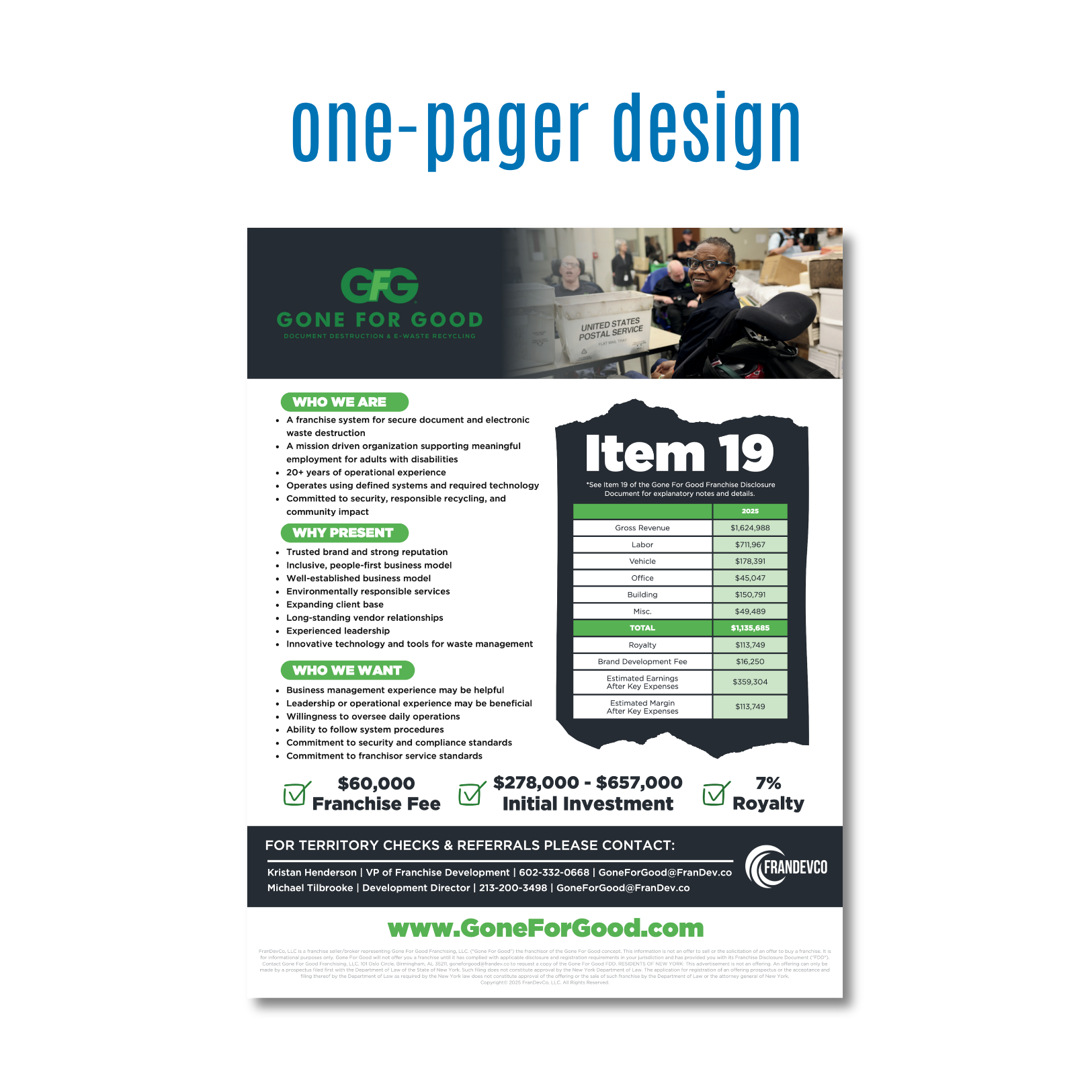
Designed a franchise recruitment one-pager for a secure document destruction and e-waste recycling company with a mission-driven business model. The objective was to create a professional sales and development tool that clearly communicated the franchise opportunity, financial investment details, and brand differentiators while appealing to prospective franchise candidates.
objectives
Present key franchise information in a clear and organized format.
Communicate the company's mission, business model, and competitive advantages.
Support franchise development efforts through effective visual communication.
Create a professional piece that builds credibility and encourages inquiries.
creative approach
Developed a clean, information-driven layout that balances detailed content with strong visual organization. The design focuses on making complex franchise data easy to scan and understand. Strategic use of color, typography, icons, and section breaks helps guide readers through the content while maintaining visual consistency with the Gone For Good brand. The design also emphasizes the organization's social impact mission, using imagery and messaging that highlight both the business opportunity and the meaningful work performed by the company.
skills demonstrated
Marketing Collateral Design
Franchise Development Materials
Information Design
Typography
Visual Hierarchy
Layout & Composition
Brand Consistency
Print & Digital Design
Marketing Communications
Data Presentation
Sales Enablement Design
results
Delivered a professional one-pager that transformed detailed franchise information into a visually engaging and accessible marketing tool. The final design helped communicate the value of the franchise opportunity while reinforcing Gone For Good's unique position as a socially responsible business with a proven operational model.
project overview
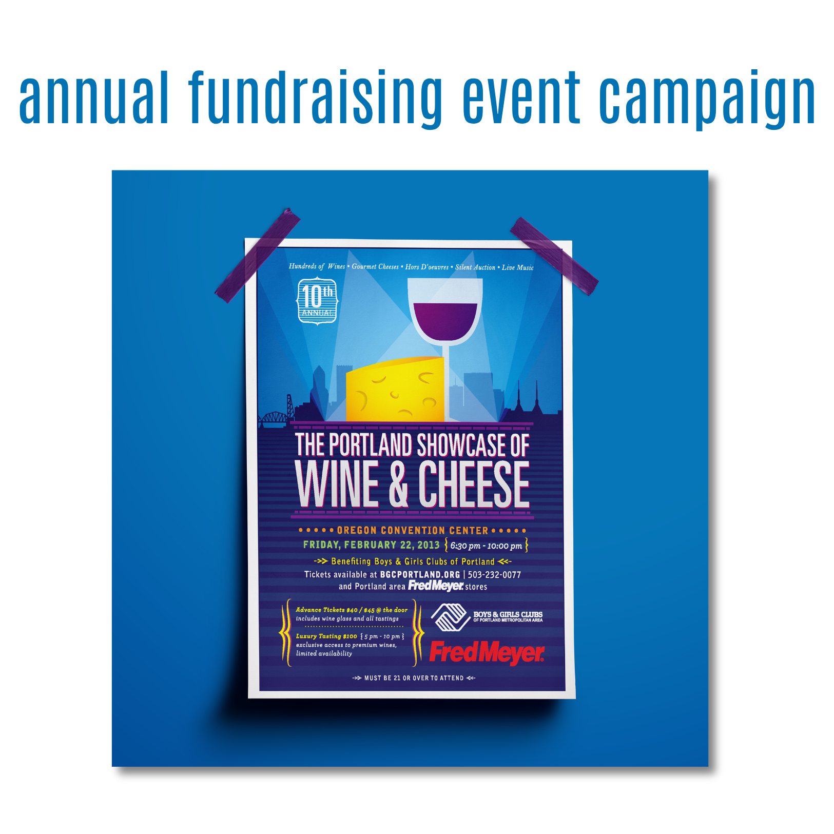
Designed a promotional poster for the Boys & Girls Clubs of Portland's annual Wine & Cheese Showcase fundraiser. The objective was to create a visually compelling piece that would generate interest, communicate event details clearly, and encourage ticket sales while reflecting the sophistication of the event and supporting a meaningful community cause.
objectives
Increase awareness and attendance for the annual fundraising event.
Communicate event information quickly and effectively.
Create a premium, upscale feel that aligns with a wine and cheese tasting experience.
Support fundraising efforts through engaging visual communication.
creative approach
Developed a bold design that combines vibrant color, custom illustration, and strong typography to create a memorable print piece. Inspired by Portland's skyline and local culture, the design incorporates recognizable city elements alongside wine and cheese imagery to establish a sense of place and event identity. The layout was structured to capture attention immediately with the event title while guiding viewers through key details such as date, location, ticket information, and sponsors. Strategic use of contrast, color, and hierarchy ensures readability while maintaining visual excitement.
skills demonstrated
Poster Design
Event Marketing & Promotion
Typography
Visual Hierarchy
Layout & Composition
Fundraising Campaign Design
Brand & Event Identity
Print Design
Creative Concept Development
Visual Storytelling
results
Delivered a vibrant and engaging promotional poster that effectively communicated event details while reinforcing the importance of supporting the Boys & Girls Clubs of Portland. The final design helped elevate the event's visibility and created a strong visual presence across promotional channels.
project overview
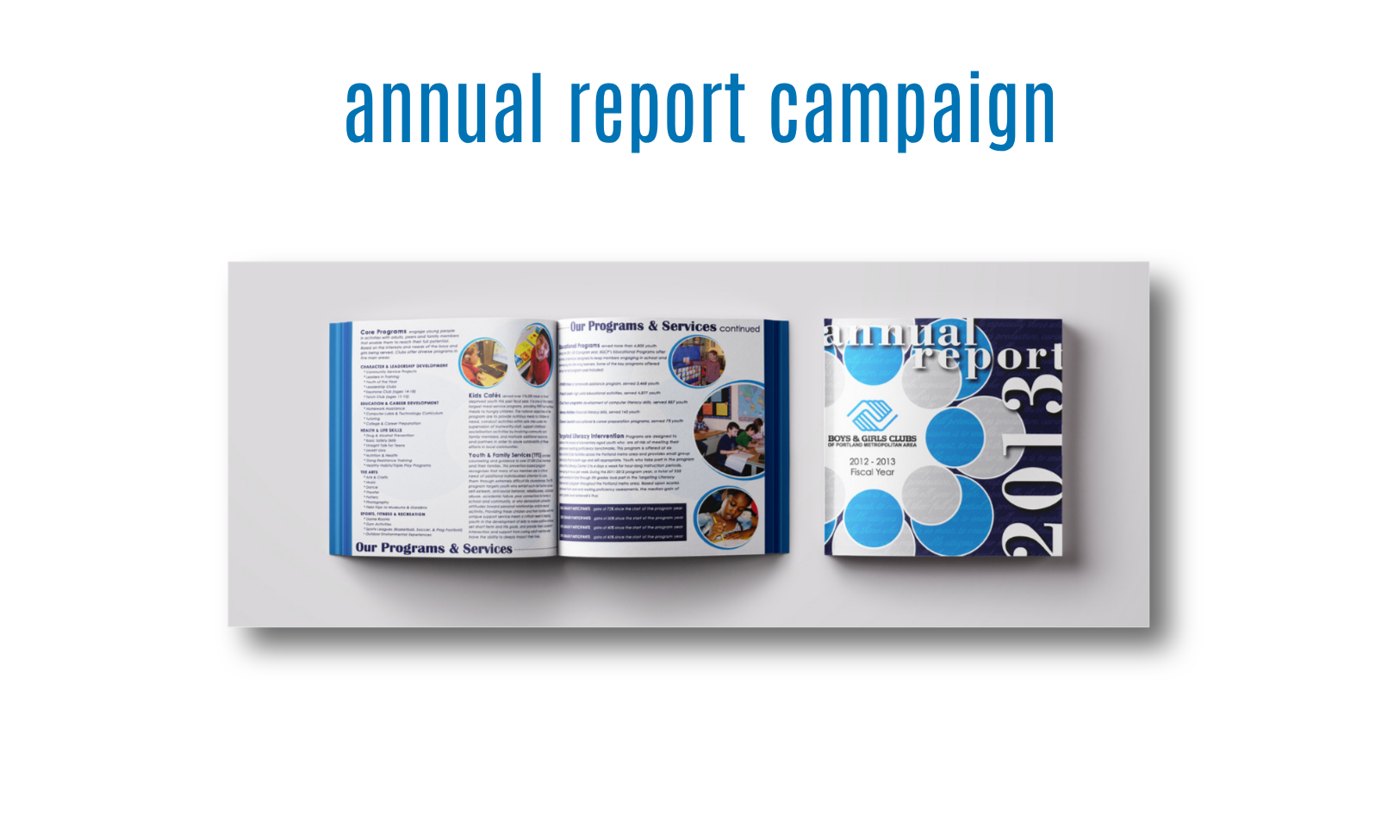
Designed a comprehensive annual report for the Boys & Girls Clubs of Portland to communicate organizational impact, highlight program successes, and share key financial and operational information with donors, stakeholders, community partners, and supporters. The goal was to transform complex information into an engaging publication that reinforced the organization's mission while celebrating a year of achievements.
objectives
Present annual accomplishments, financial data, and program outcomes in an accessible format.
Strengthen trust and transparency with donors, sponsors, and community stakeholders.
Create a visually engaging publication that encourages readers to explore and understand the organization's impact.
Maintain brand consistency while elevating the overall presentation of the report.
creative approach
Developed a clean, professional publication that balances storytelling, photography, data, and organizational messaging. The design system uses a consistent visual structure throughout the report, allowing readers to easily navigate content while maintaining engagement across multiple pages. To make complex information more approachable, I incorporated visual hierarchy, color-coded sections, imagery, and strategic layout techniques that guide readers through key messages and outcomes. The design was created to support both readability and visual interest, ensuring important information could be absorbed quickly without overwhelming the audience.
skills demonstrated
Annual Report Design
Editorial Design
Publication Layout
Typography
Information Design
Visual Hierarchy
Print Production
Brand Consistency
Data Presentation
Storytelling Through Design
Multi-Page Document Design
results
Delivered a polished annual report that effectively communicated the Boys & Girls Clubs of Portland's achievements, programs, and community impact. The final publication provided stakeholders with a clear understanding of the organization's work while strengthening brand perception and supporting ongoing donor and community engagement efforts.
project overview
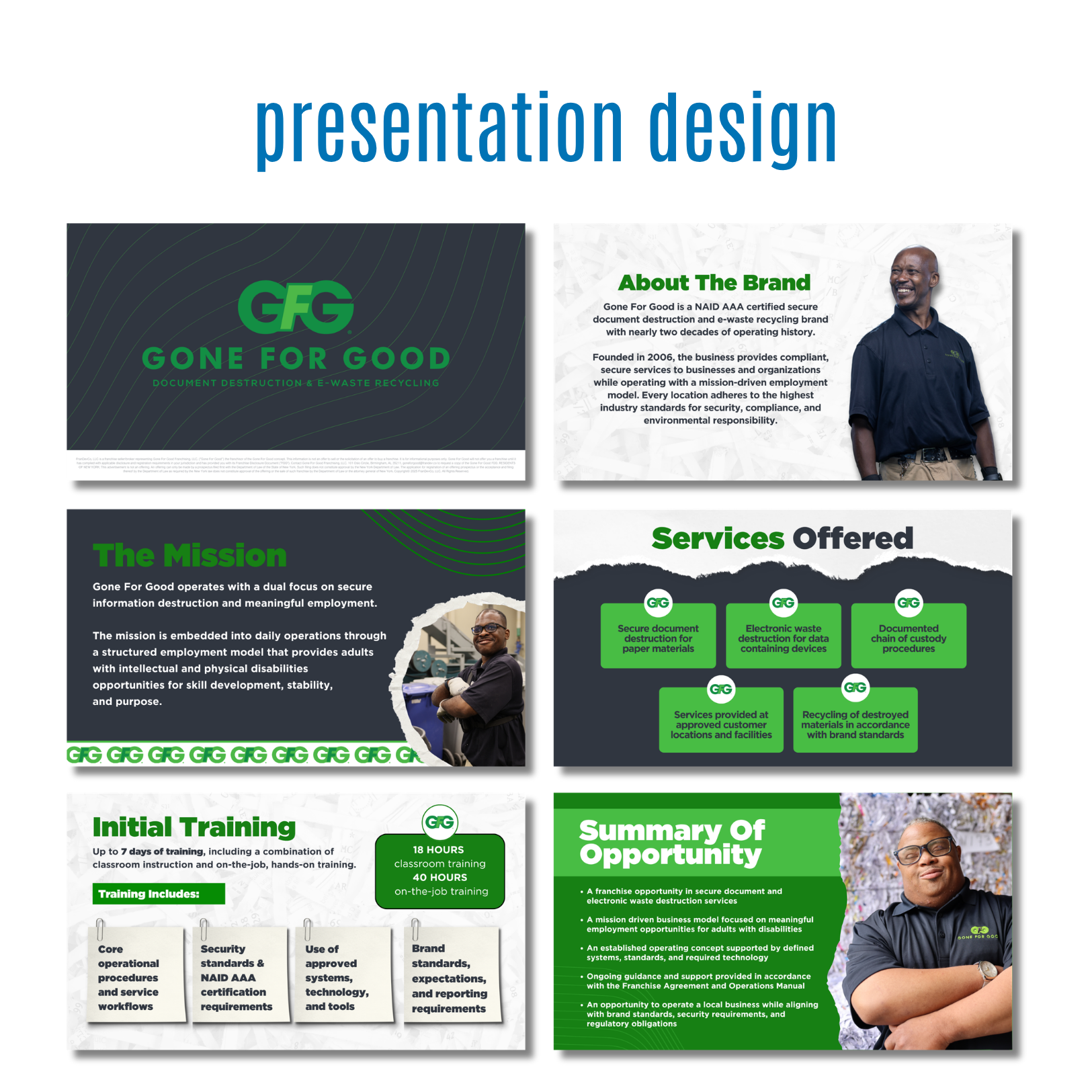
Designed a franchise development presentation for Gone For Good, a secure document destruction and e-waste recycling company with a strong social mission. The presentation was created to introduce prospective franchise candidates to the brand, communicate the business opportunity, and explain the company's combination of operational excellence and meaningful employment initiatives.
objectives
Present the franchise opportunity in a clear, engaging, and professional format.
Communicate the company's mission, services, training, and operational model.
Build credibility and trust with prospective franchise owners.
Create a cohesive presentation that supports sales and franchise development conversations.
creative approach
Developed a modern presentation system that balances business information with human-centered storytelling. The design incorporates the brand's bold green color palette, clean typography, and employee-focused imagery to highlight both the operational strengths of the business and its mission-driven purpose. Each slide was intentionally structured to simplify complex information, using clear content hierarchy, visual segmentation, and supporting graphics to improve comprehension and audience engagement. The overall design creates a professional experience while emphasizing the organization's commitment to security, sustainability, and inclusive employment.
skills demonstrated
Presentation Design
Sales Enablement Materials
Franchise Development Marketing
Information Design
Typography
Visual Hierarchy
Brand Consistency
Marketing Communications
Corporate Design
Storytelling Through Design
Content Organization
results
Delivered a polished franchise development presentation that effectively communicates Gone For Good's business model, mission, services, and growth opportunity. The final presentation provides franchise consultants and prospective owners with a clear understanding of the brand while supporting business development and recruitment efforts.
project overview
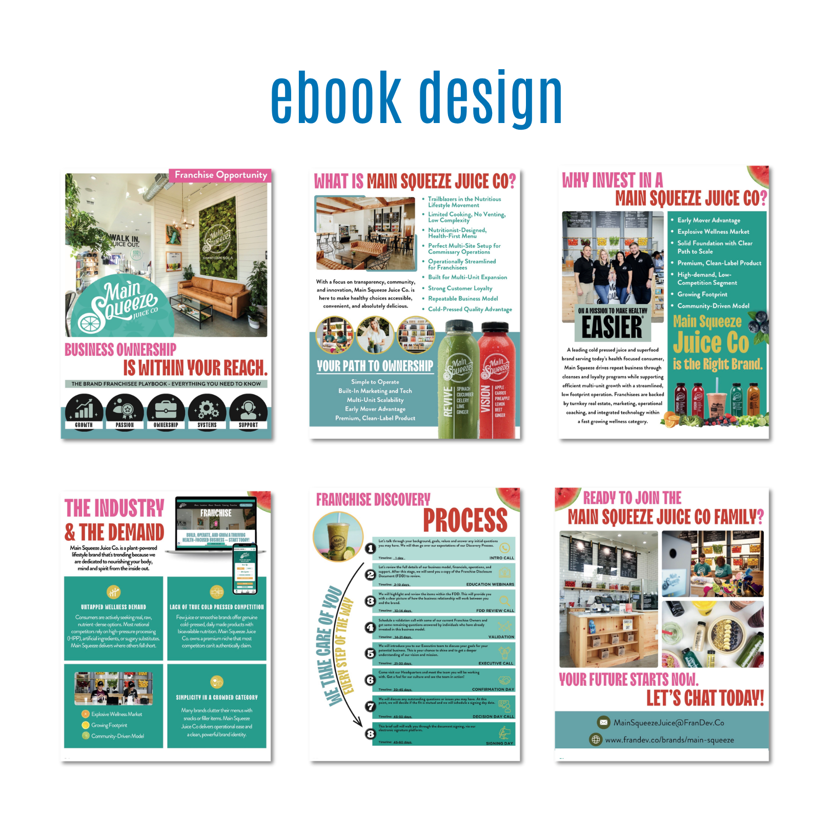
Designed a multi-page digital eBook for Main Squeeze Juice Co. to support franchise development and educate prospective franchise owners about the brand, business model, and investment opportunity. The goal was to create a visually engaging lead-generation asset that could guide prospects through the franchise discovery process while reinforcing the company's fresh, health-focused brand identity.
objectives
Generate interest from prospective franchise candidates.
Communicate the benefits, values, and growth potential of the Main Squeeze Juice Co.
Simplify complex franchise information into an engaging and easy-to-understand format.
Create a polished marketing asset that supports lead nurturing and franchise sales efforts.
creative approach
Developed a vibrant, brand-forward eBook that reflects Main Squeeze Juice Co.'s energetic, wellness-focused personality. Drawing from the brand's fresh ingredients, colorful products, and modern store environments, the design combines bold photography, bright color palettes, and structured layouts to maintain reader engagement across multiple pages. The content was carefully organized into digestible sections, allowing readers to move naturally through the franchise story—from brand overview and market opportunity to ownership benefits and the discovery process. Strategic use of typography, icons, imagery, and visual hierarchy transforms detailed franchise information into an approachable and compelling reading experience.
skills demonstrated
eBook Design
Editorial Design
Franchise Development Marketing
Digital Publication Design
Information Design
Typography
Visual Hierarchy
Brand Consistency
Marketing Communications
Sales Enablement Design
Multi-Page Layout Design
Content Strategy & Organization
results
Delivered a professional franchise recruitment eBook that effectively communicates the Main Squeeze Juice Co. opportunity while reinforcing the brand's unique position within the health and wellness market. The final piece serves as both an educational resource and a lead-generation tool, helping prospective franchisees understand the business model and move confidently through the process.
project overview
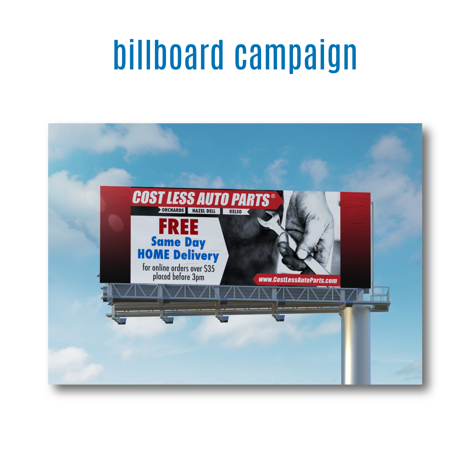
Designed a large-format billboard advertisement for Cost Less Auto Parts to promote its free same-day home delivery service. The objective was to create a high-impact outdoor advertisement that could quickly communicate the promotion to drivers while reinforcing brand recognition and encouraging online orders.
objectives
Increase awareness of the free same-day delivery service.
Communicate the offer clearly within seconds of viewing.
Reinforce Cost Less Auto Parts' brand presence across multiple markets.
Drive online orders by highlighting convenience and customer value.
creative approach
Developed a bold, highly focused billboard design that prioritizes readability and instant communication. Because outdoor advertising allows only a few seconds to capture attention, the design was strategically simplified to highlight the most important message: Free Same-Day Home Delivery. Strong brand colors, oversized typography, and high-contrast imagery work together to ensure visibility from a distance. The wrench imagery reinforces the automotive industry while supporting the brand's hardworking, customer-focused identity. Every design decision was made with speed of comprehension in mind, allowing motorists to quickly absorb the message while in motion.
skills demonstrated
Billboard Design
Outdoor Advertising
Large-Format Design
Typography
Visual Hierarchy
Marketing Communications
Brand Consistency
Layout & Composition
Advertising Design
Conversion-Focused Design
results
Delivered a visually striking billboard that effectively communicated a time-sensitive service offering while strengthening brand visibility. The final design transformed a complex service message into a simple, memorable advertisement that could be understood in seconds, helping support customer awareness and online purchasing efforts.
project overview
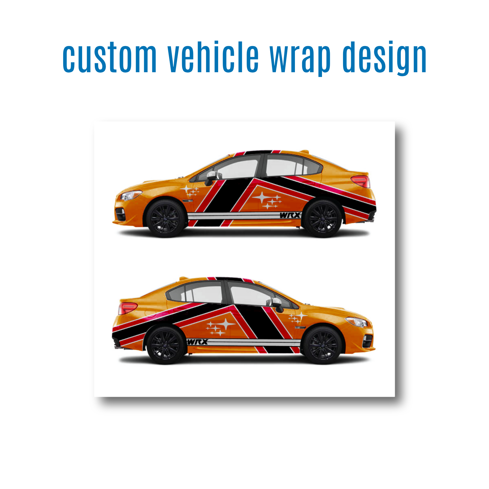
Designed a custom vehicle wrap concept for a Subaru WRX, transforming the vehicle into a bold, high-impact visual statement. The goal was to create a design that complemented the vehicle's sporty personality while incorporating dynamic graphics, color contrast, and movement to enhance its presence on the road.
objectives
Create a visually striking wrap that reflects the performance-oriented nature of the Subaru WRX.
Develop a cohesive design that works seamlessly across both sides of the vehicle.
Use color, shape, and composition to create a sense of speed and movement.
Ensure the design remains impactful from both close-up and long-distance viewing.
creative approach
Drawing inspiration from motorsports and rally-inspired graphics, I created an angular wrap design that emphasizes motion and energy. Bold geometric shapes sweep across the vehicle's body, creating visual flow from front to rear while accentuating the WRX's aggressive lines. The combination of black, red, and white graphics against the vibrant orange paint creates strong contrast and immediate visual impact. Strategic placement of graphic elements allows the vehicle's natural contours to become part of the design, helping the wrap feel integrated rather than simply applied.
skills demonstrated
Vehicle Wrap Design
Large-Format Design
Vector Illustration
Brand & Environmental Graphics
Layout & Composition
Color Theory
Production Design
Creative Concept Development
Visual Storytelling
Adobe Illustrator & Adobe Photoshop
results
Delivered a custom vehicle wrap concept that transforms the Subaru WRX into a distinctive visual statement while highlighting the vehicle's performance-inspired character. The final design combines bold graphics, strategic composition, and strong color contrast to create an eye-catching wrap that stands out both on the road and at automotive events.
project overview
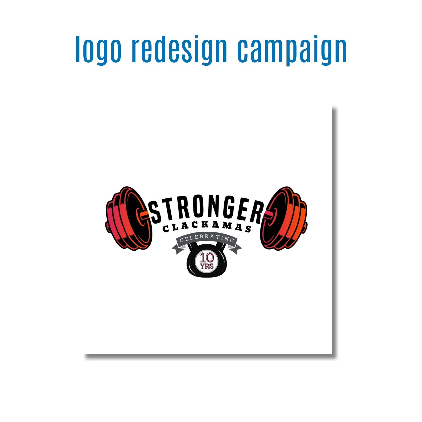
Redesigned the logo for Stronger Clackamas, a community-focused fitness initiative celebrating its 10-year anniversary. The objective was to modernize the organization's visual identity while honoring its decade-long commitment to promoting health, strength, and wellness throughout the community.
objectives
Refresh the existing brand identity for the organization's milestone anniversary.
Create a bold, recognizable logo that reflects strength, determination, and community.
Incorporate a visual reference to the 10-year celebration without compromising usability.
Develop a versatile mark that could be applied across digital, print, signage, and event materials.
creative approach
The redesign centered around the concept of strength and achievement, using illustrated weight plates and a kettlebell to visually represent fitness, perseverance, and progress. The typography was updated to create a stronger, more modern presence while maintaining a sense of approachability and community involvement. The anniversary element was integrated directly into the design through a commemorative badge, allowing the logo to celebrate the organization's milestone while remaining cohesive and visually balanced. The overall composition was designed to be bold, memorable, and instantly recognizable across a variety of applications.
skills demonstrated
Logo Design
Brand Identity Design
Visual Concept Development
Typography
Vector Illustration
Brand Strategy
Creative Problem Solving
Marketing Design
Scalable Design Systems
Event Branding
results
Delivered a modernized anniversary logo that successfully celebrated Stronger Clackamas's 10-year milestone while reinforcing the organization's identity and mission. The final design provided a recognizable and versatile brand asset that could be used across promotional materials, event signage, apparel, social media, and community outreach efforts.